
A look + feel that hits close to home.
In February 2025, after major research funding cuts, Duke had to decide: stick with our usual upbeat March Madness ad, or seize this high-visibility moment to make a statement?
As an R1 university, Duke depends on federal research funding, which enables life-saving work.
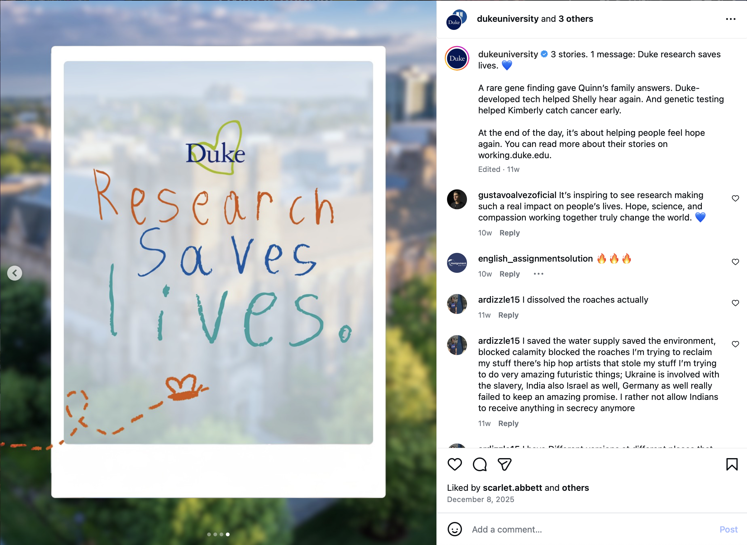
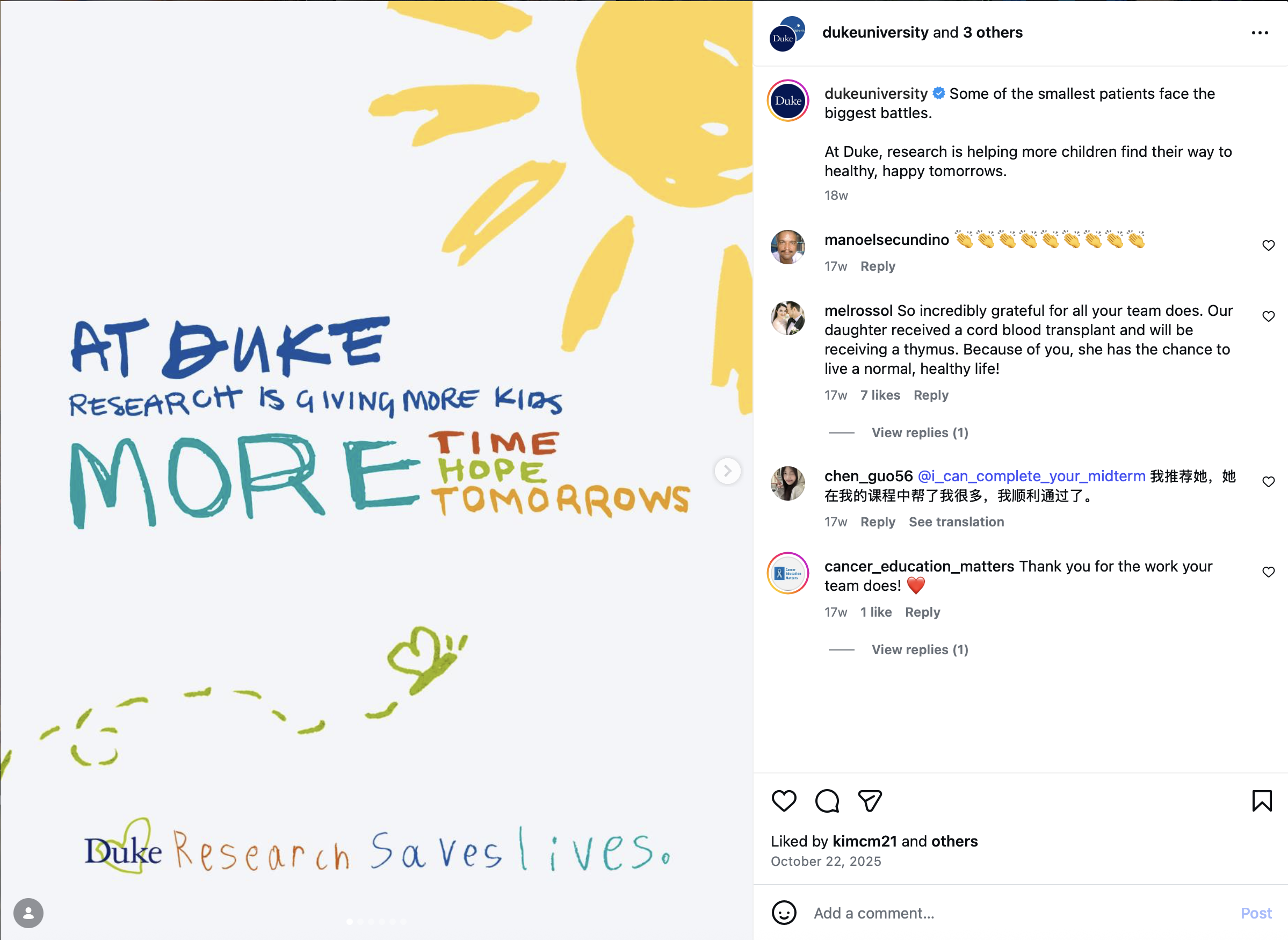
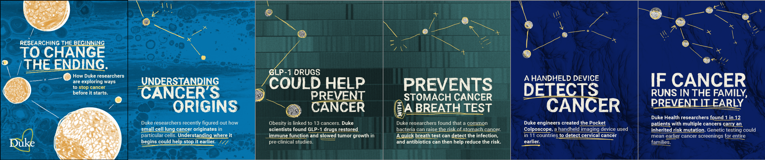
We aimed to make the campaign relatable and stop the scroll, meeting people at their dinner tables with quick, simple, and effective messaging. Inspired by a Chanel ad, I used handwritten elements and childlike drawings in the visuals.
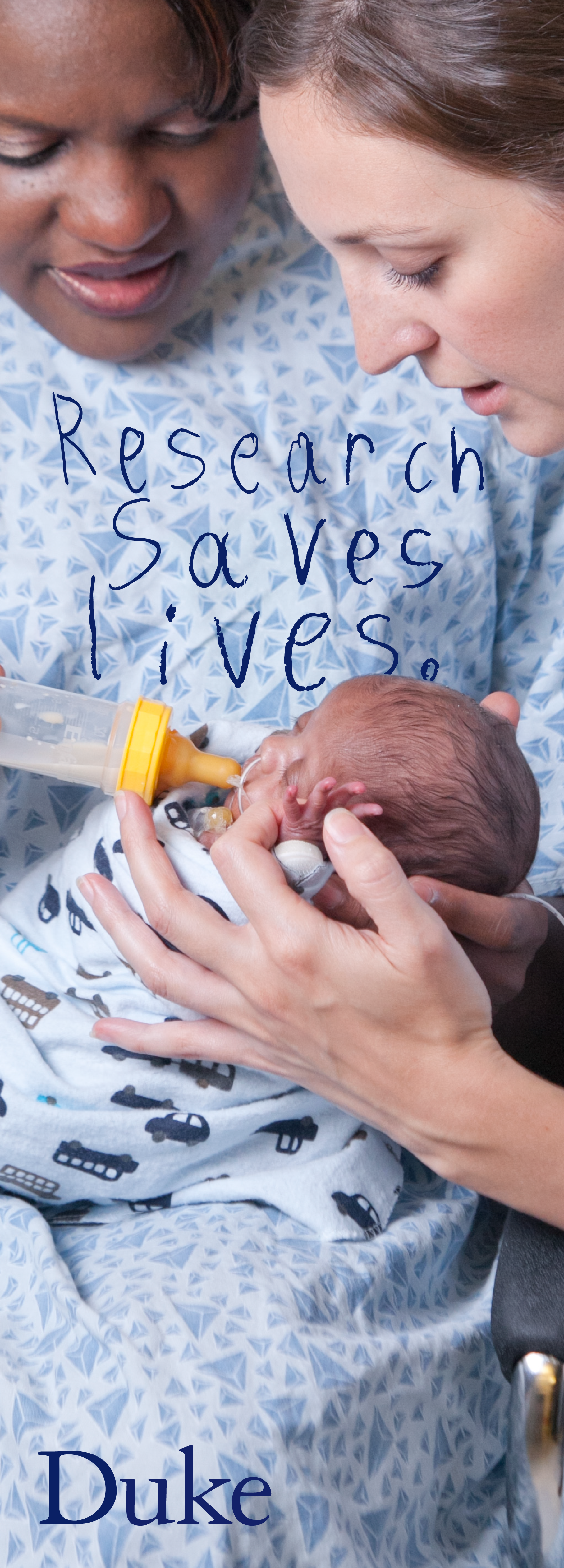
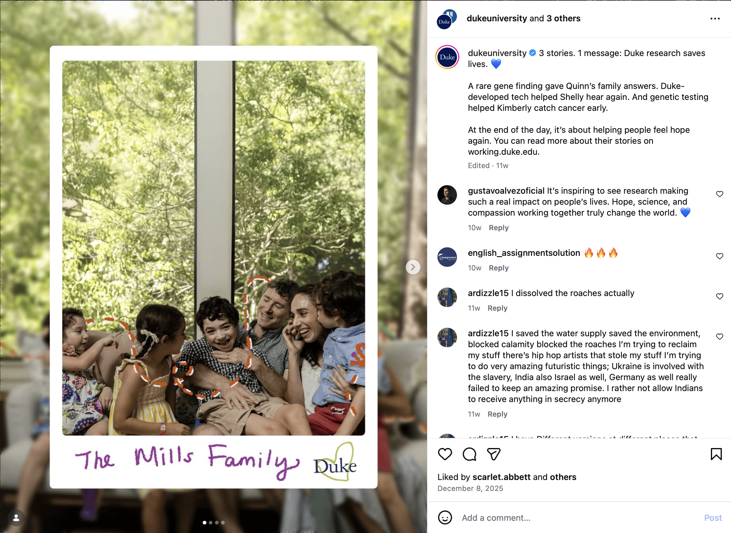
We highlighted real family moments—dinner-table conversations, kids playing and learning, and plain headlines. We implemented actual testimonials from parents and patients, which made the campaign feel familiar and trustworthy.
I kept thinking of a Chanel Mother’s Day ad featuring a child’s drawing—simple but memorable, even though Chanel isn’t a brand I usually connect with. Like Duke, Chanel carries preconceived notions, but that ad cut through them.
As the sole in-house designer, I had four days to develop multiple visual options for phase one of the campaign. I brainstormed visual directions, created a mind map, built moodboards, and drafted three distinct concepts.
I gathered feedback from managers and stakeholders, adjusting the creative to align with our goals. One manager’s son even contributed handwriting samples for the visuals.
This collaborative process ensured the final designs resonated with both the team and our audience.
We wanted viewers to connect research impact with their loved ones’ futures. Our target: adults 35–50 in rural or military communities—groups united by strong family values and concern for children's well-being, identified through research and outreach data. This shared focus became our campaign’s point of connection.
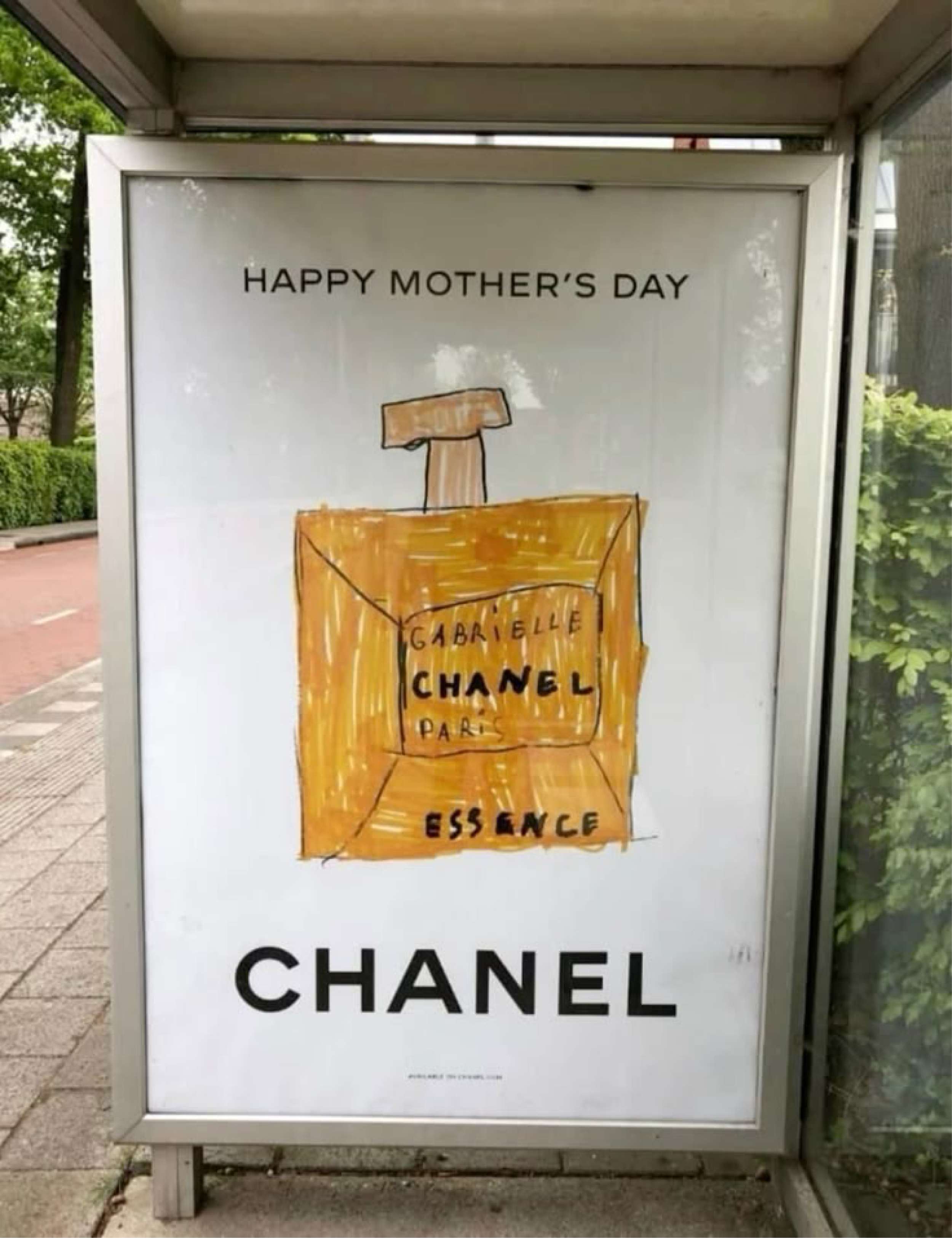
Chanel Ad Inspo
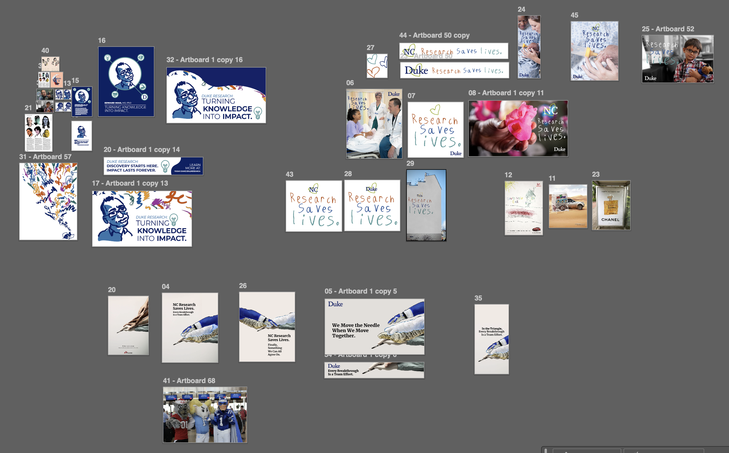
Initial Pitch
Early Iteration
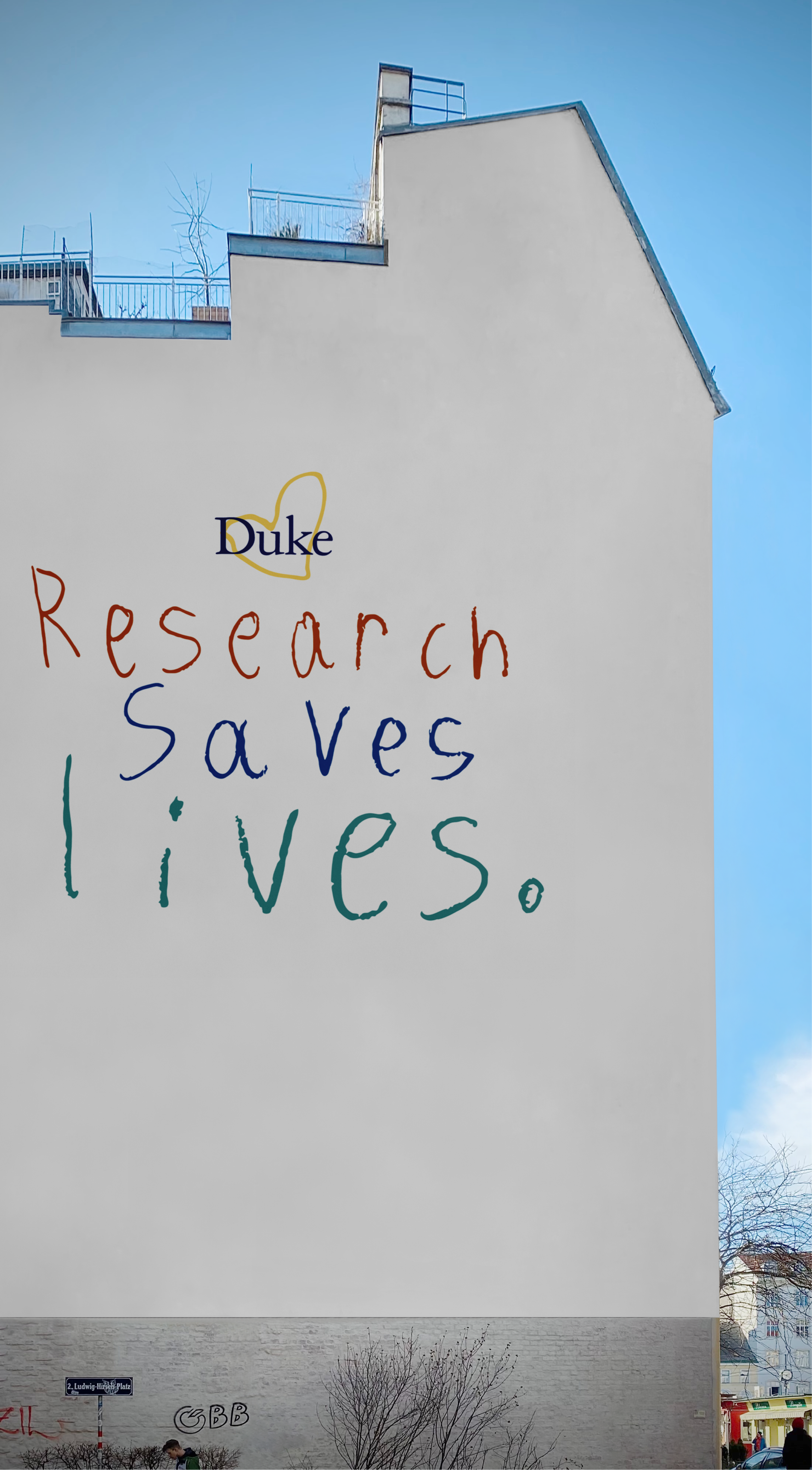
Early Mural Mockup
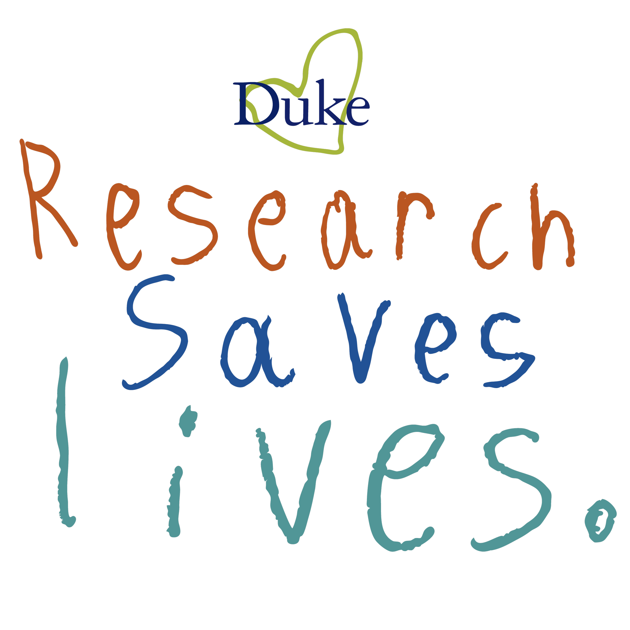
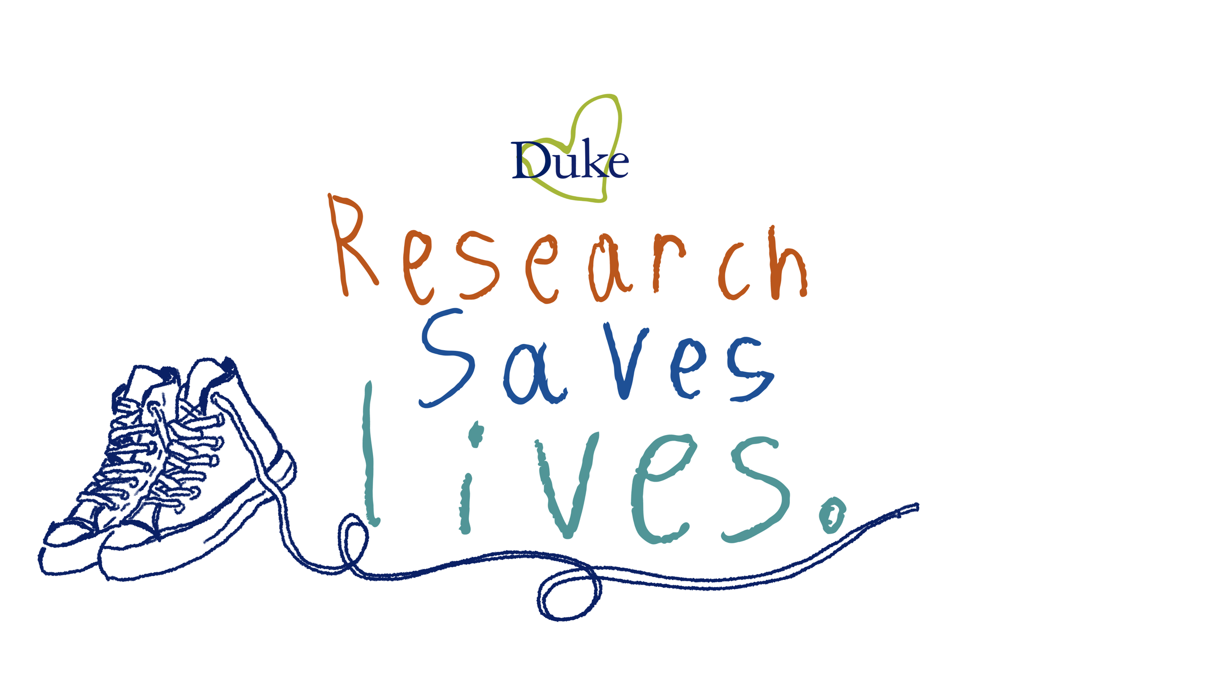
Final Lockup
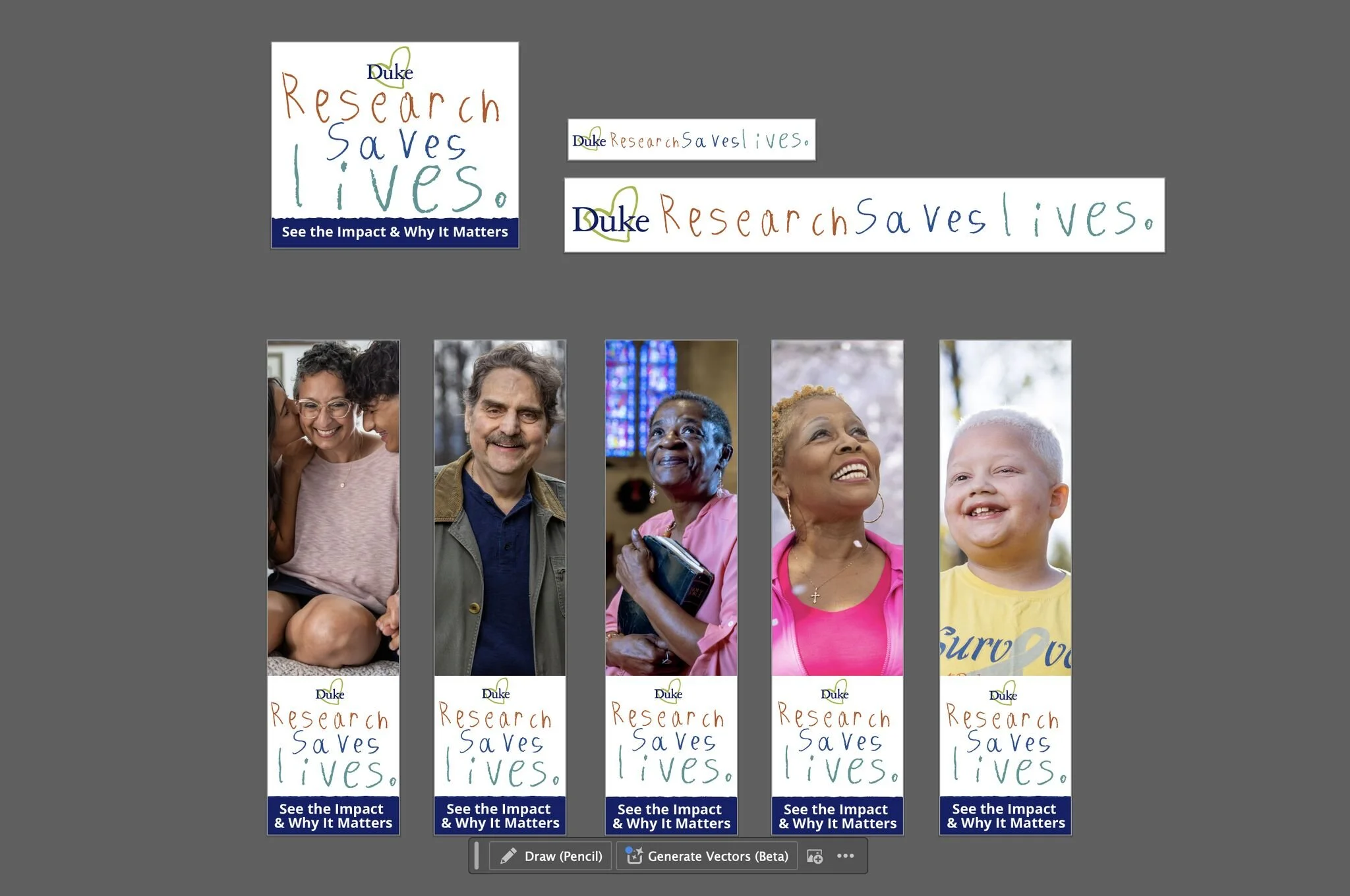
Digital Ads
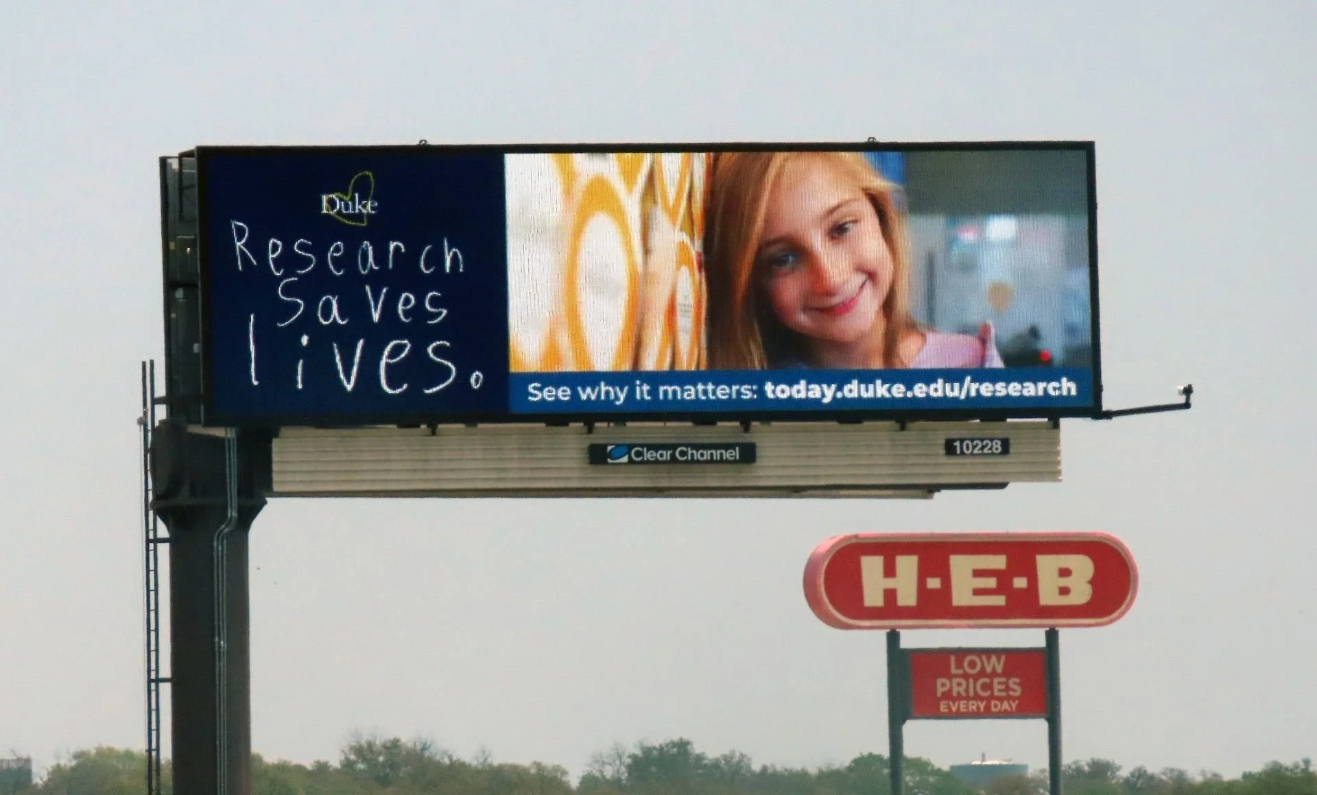
2025 San Antonio Billboard, March Madness Tournament
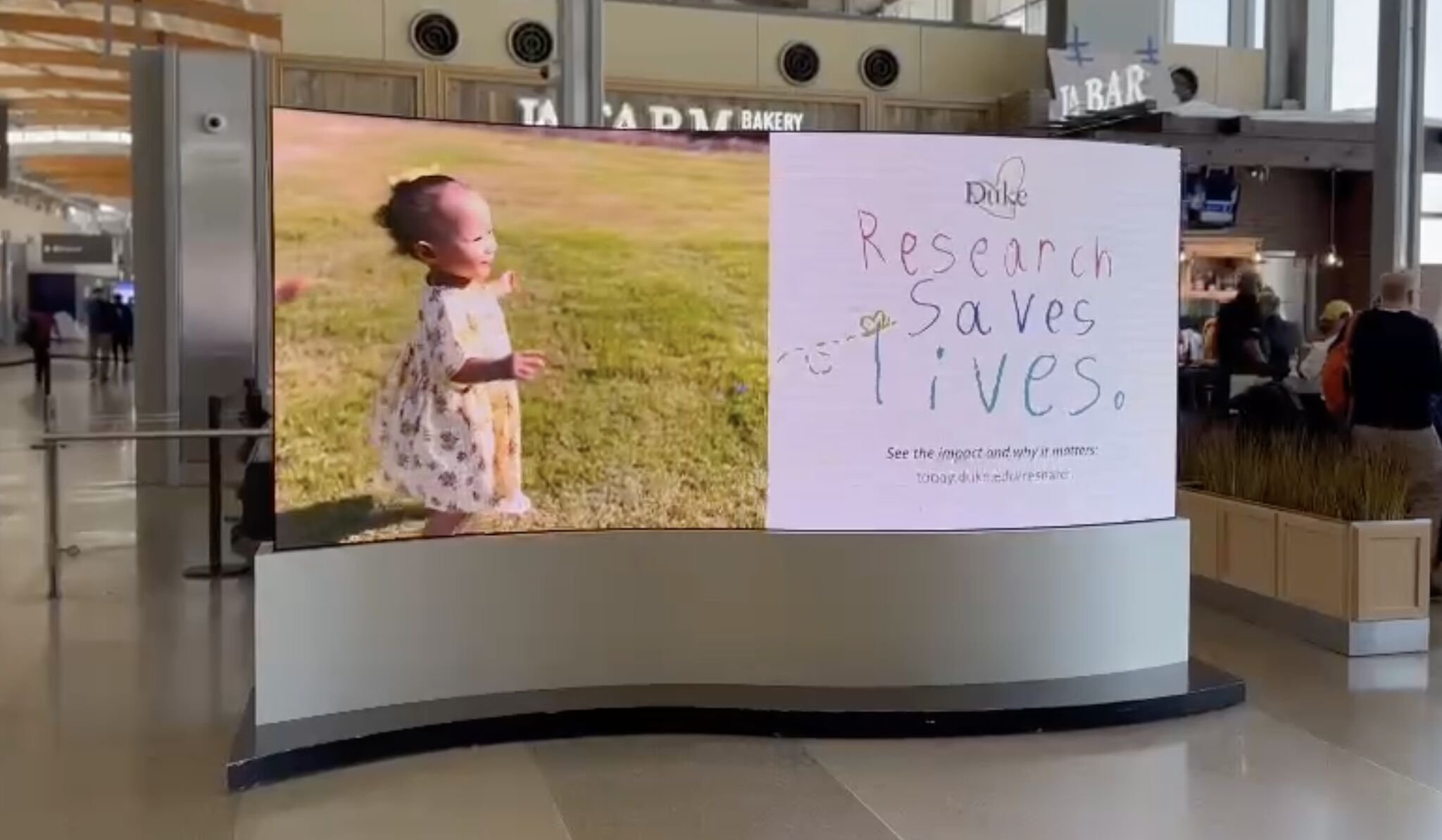
RDU Airport Digital Screen

YouTube Thumbnail Treatments
Ongoing Social Campaign
Ongoing Social Campaign
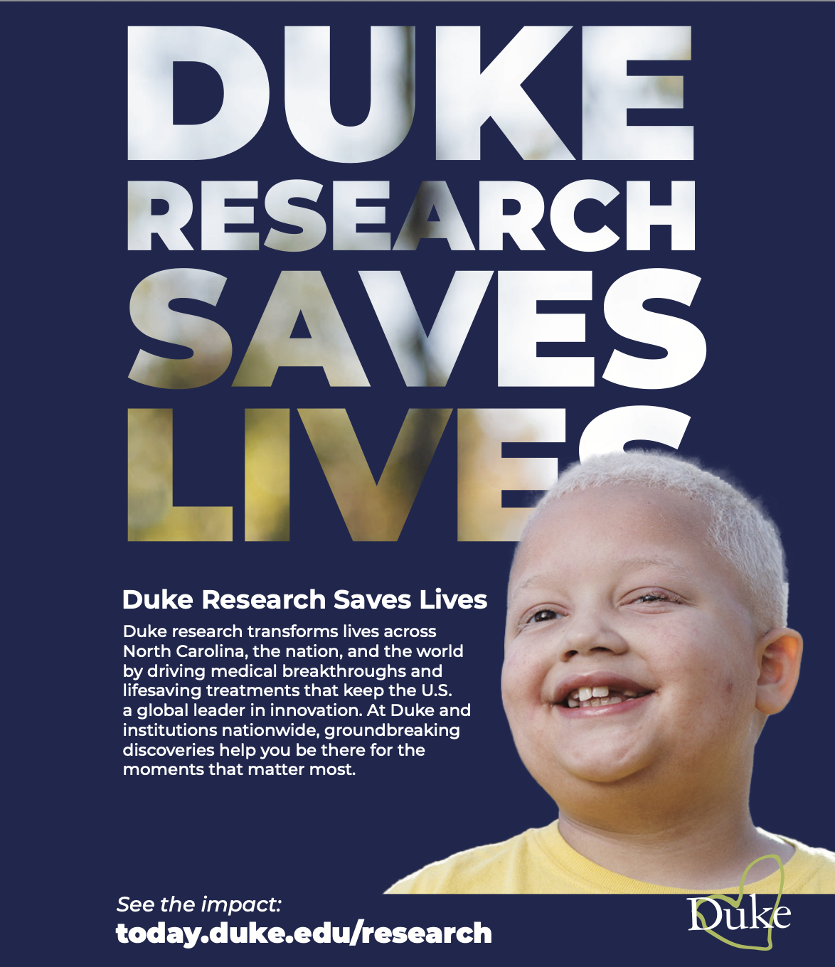
Magazine Print Ad
Ongoing Social Campaign
2026 30-Second Spot End Card